Junk journaling is more than just scrapbooking it’s the art of layering texture, color, and found objects to tell a story on the page.
If you are looking for fresh inspiration to make your next spread interactive, meaningful, and fun, you’ve come to the right place.
Here are five detailed ideas, complete with steps, to transform your journal into a treasured work of art.
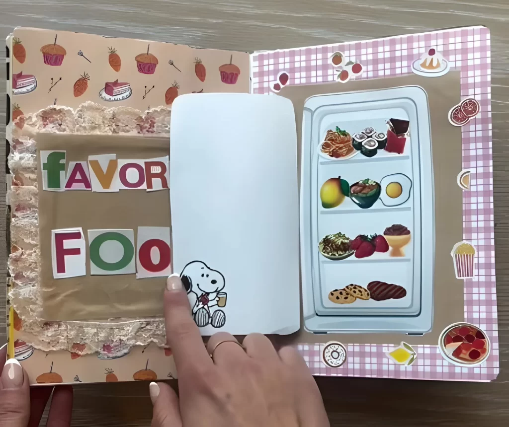
1. The Culinary Collection Flip Out
This spread is perfect for cataloging your favorite recipes, documenting a special meal, or simply celebrating your love of food. It uses a clever flap to reveal a hidden surprise.
Your Step by Step Guide:
Establish the Background: Start with a warm, textured background on the right page a simple brown paper or a subtle checkered pattern works well. Frame this with a vibrant edge, like the pink gingham shown here.
Create the Title: On the left page, use ripped brown paper as a foundation and layer chunky, cut out magazine letters to spell out your theme, such as “FAVOR FOOD.” Add texture with lace trim or decorative tape along the edge.
Construct the Fridge Flap: Cut a large rectangle of plain white cardstock. This will serve as your refrigerator door.
Hinge the left edge of this “door” to the center fold of your journal, ensuring it covers the space where the interior of the fridge will go.
Stock the Fridge: Before gluing down the door, adhere a large, detailed sticker or illustration of a fully stocked refrigerator interior onto the right hand page.
Add Whimsy: Place a charming sticker (like the Snoopy figure) near the opening of the door to complete the scene. When the white door is lifted, the colorful contents are revealed!
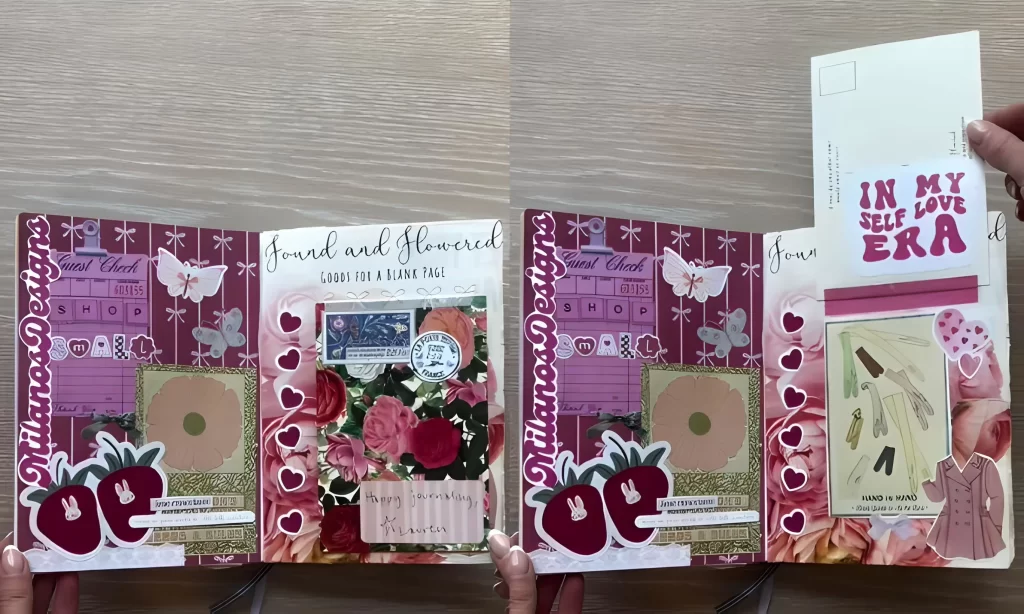
2. The Romantic Self Care Secret Pocket
This idea emphasizes rich color palettes, heavy layering, and an interactive element perfect for storing positive affirmations or treasured notes.
Your Step by Step Guide:
Layer the Foundation: Cover both pages with a deep, romantic background paper, such as a rich floral magenta or burgundy pattern. Use contrasting paper strips to define the top and bottom borders.
Build the Collage: Use reproductions of vintage ephemera like guest checks or receipt papers as foundational layers. Don’t be afraid to overlap these pieces significantly across the spread.
Introduce Dimensional Elements: Place large, striking die cuts (like the strawberries or butterflies) so they overlap the center fold. This creates a cohesive, single image when the spread is open.
Create the Secret Pocket: On the right hand side, use a postcard or a large, stiff card. Apply glue only to the bottom edge and the two vertical edges, leaving the top open. Adhere this to the page to form a deep pocket.
Add the Pull Out: Design a coordinating tag or strip of paper with a personal message, title (like “IN MY SELF LOVE ERA”), or meaningful quote. Slide this into the newly created pocket for a hidden surprise.
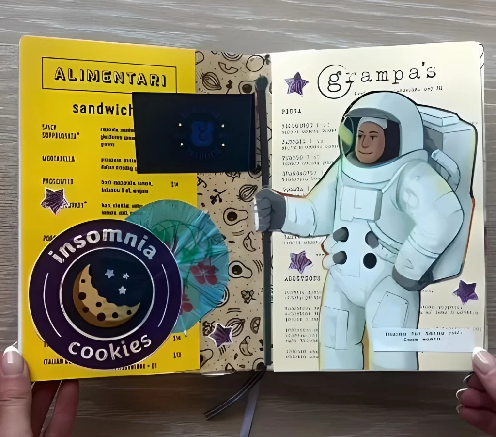
3. The Whimsical Diner Menu Spread
Mixes playful illustrations with realistic menu formatting for a fun, themed journal entry.
Your Step by Step Guide:
Split the Pages: Use contrasting background colors to divide the focus a bright, solid yellow for the left side (the menu listings) and a lighter cream or patterned paper for the right (the feature image).
Format the Menu: Use stencils or typography stickers to create headers like “ALIMENTARI” or “PIZZA.” Write or type out mock menu items and prices in small, neat print.
Add Menu Detail: Layer small die cut placards (like the black and yellow “sandwich” card) to distinguish categories. Add smaller thematic stickers (like the “Insomnia Cookies” patch) to tie into the food theme.
Center the Feature: Find a large, whimsical image like the astronaut illustration and center it on the right page. This character acts as the star of the spread.
Make it Interactive: Consider adhering the feature image only along the top and bottom edges, allowing you to slip a small note or ticket stub behind the figure, turning the illustration itself into a discreet pocket.
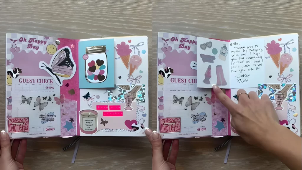
4. The Pastel Pink Sweet Treat Flip
Perfect for documenting a shopping trip, a favorite sweet indulgence, or simply adding a touch of pastel cheer to your pages.
Your Step by Step Guide:
Establish a Sweet Palette: Work primarily with pastel pinks, creams, and accents of cherry red. Use patterned paper featuring ice cream cones, cherries, or small hearts.
Build the Base Layers: Use the reverse side of old checks or receipts (guest checks) as the foundational layer on both pages. This adds instant texture and a retail theme.
Add Dimensionality: Incorporate stickers and die cuts with a slight lift use foam squares behind a jar sticker or a large butterfly to make them pop off the page.
Create the Flap Reveal: Select a small card or decorative piece (the pink glittery paper shown here). Adhere this piece using only a strip of decorative tape along the top edge, creating a hinge.
The Hidden Message: Underneath this hinged flap, adhere a handwritten note, a piece of small ephemera, or a photo that is only revealed when the flap is lifted.
5. The Personalized Facts & Favorites Profile
A fantastic structural idea for an “About Me” page that organizes information clearly while utilizing bright color blocking.
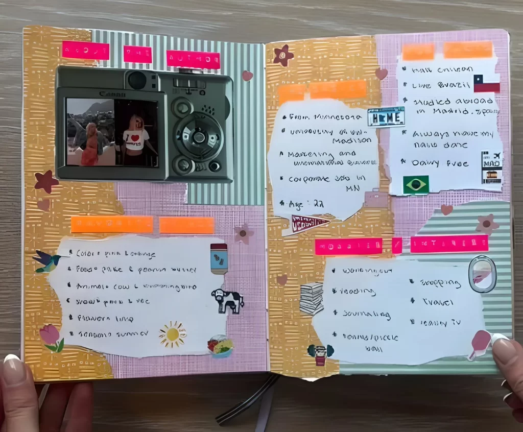
Your Step by Step Guide:
Select the Structure: Choose a light, neutral background with a subtle pattern, like the pastel striped paper used here.
Create Torn Lists: Tear strips of plain white or cream paper, ensuring the edges remain raw. This adds instant texture and defines the list areas.
Highlight with Neon: Use bright, contrasting colors of highlighter tape or washi tape (neon pink, orange) along the top and bottom of each torn list strip to act as instant section headers (e.g., “FAVORITES,” “INTERESTS”).
Anchor the Page: On the left, feature one prominent dimensional element, such as a large sticker or die cut of a camera. If the camera is a plastic element, use it as a frame for a small photo or as a pocket.
Fill the Spaces: Write out your various lists in clean handwriting. Complete the look by tucking in small, thematic stickers a flag for facts about travel, or a sun for favorite seasons next to the corresponding list items.
6. The Detailed Art Collage with Interactive Pockets
This approach elevates a simple journal spread into a complex, layered piece that demands closer inspection. It relies on rich, vintage imagery, cohesive color palettes, and surprising interactive elements.
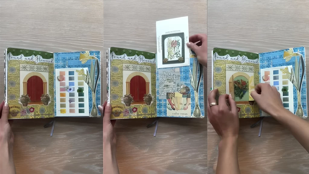
Steps to Achieve This Look:
Establish the Foundation: Start with a heavily textured background. Notice how the base layer uses a bold blue patterned paper (like a grid or checkerboard) overlaid with softer, antiqued paper elements, creating visual depth immediately.
Create a Central Motif: Use a large piece of ephemera (such as the archway or garden scene here) as the focal point. Center it on the page to draw the eye inward, mimicking the look of a framed illustration.
Integrate Visual Swatches: Incorporate color palettes. You can achieve this by gluing down old watercolor swatches, paint chips, or small squares of different patterned papers, treating them like a decorative element rather than a reference guide.
Add Interactive Flaps: Introduce a pocket or flap. As you can see, a card is tucked into the binding, often used for secret journaling notes or housing smaller pieces of memorabilia. Ensure the flap art ties into the main theme (like using a matching floral illustration).
Finalize with Detail: Use tiny, precise cutouts (like the small flowers or snippets of text) to fill in the corners and edges, blending the different background papers seamlessly.
7. Bold Typography & Repurposed Packaging Graphics
Forget subtle layering this style is loud, graphic, and uses commercial packaging as its primary source of artwork. This is a fantastic way to honor everyday retail trips by turning shopping bags into stunning collages.
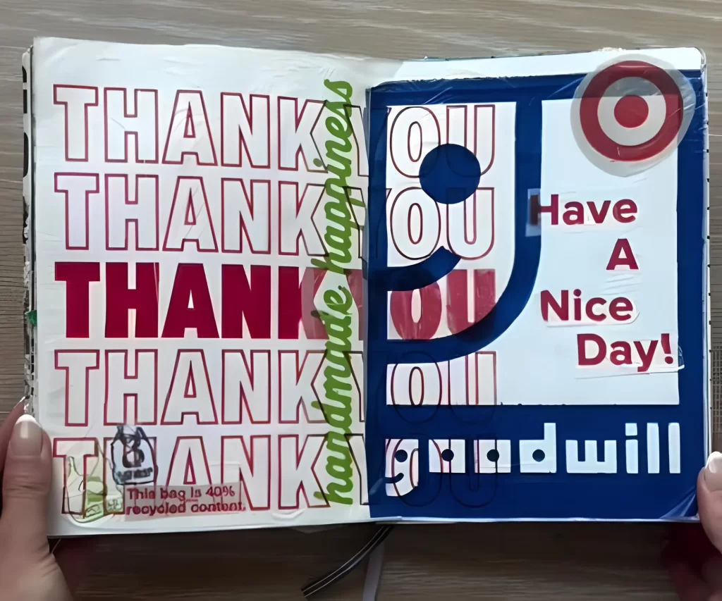
Steps to Achieve This Look:
Select Your Materials: Gather plastic or paper bags that feature strong, high-contrast typography and iconic logos (like the bold “THANK YOU” repeated pattern or the Goodwill and Target motifs seen here).
Isolate the Text: Carefully cut out the most striking words or phrases. For maximum impact, focus on repeating the text block or layering it so the words overlap in a chaotic but intentional pattern.
Build a Color Block: Design one side of the spread to be primarily text based (the red and white side), and the adjacent side to feature a large, dominant color block (the blue block). This creates necessary visual tension.
Layer with Gloss: Use pieces of the glossy plastic bag texture. The Target bullseye sticker, for instance, adds a smooth, professional finish against the crinkled paper textures.
Add Small Sentiments: Include small handwritten or stamped phrases like “handmade happiness” to bridge the commercial imagery with your personal journaling style.
8. Event Specific Memory Keeping
When you are documenting a specific trip or celebration, a themed journal spread helps capture the mood and memory immediately. This Chicago-themed spread focuses on an intense, unified color scheme and local memorabilia.
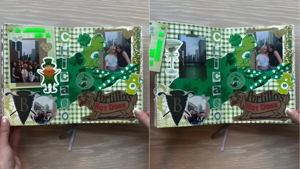
Steps to Achieve This Look:
Define the Theme and Color: Choose a very specific color that represents the event (in this case, multiple shades of St. Patrick’s Day green). Select a background paper that supports this theme, such as the green gingham check.
Anchor with Photos: Place your personal photos first. Use small amounts of glitter tape or thin borders to frame them, allowing the background paper to shine through.
Include Local Memorabilia: Integrate elements specific to the location or trip. The Portillo’s Hot Dogs logo and the ‘Chicago’ text cutouts instantly ground the memory in a specific place.
Use Thematic Ephemera: Layer specialized stickers and die-cuts (leprechauns, shamrocks, martinis) to amplify the celebratory feel. Don’t be afraid to overlap these elements over the photos and text.
Create Dimension: Use foam adhesive squares beneath some stickers or photos to pop them up, giving the page a rich, layered, and three-dimensional effect.
9. Themed Packaging Layout (Food Focus)
This idea turns large pieces of takeout or food packaging into an immersive, single-topic journal spread. Instead of cutting up the packaging, you treat the entire bag as your canvas.
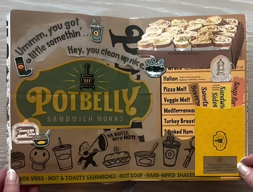
Steps to Achieve This Look:
Source the Canvas: Find a substantial piece of food packaging (a bag, a large liner, or a menu) with interesting graphics and texture, such as the rustic brown paper from Potbelly Sandwich Works shown here.
Utilize Existing Text: Let the company logo and menu text serve as the main decorative element. Position the packaging so that the text naturally frames the page.
Add Related Doodles and Stickers: Use small, cartoonish food and drink stickers (coffee cups, sandwiches, soup bowls) to fill in the negative space around the large graphics. This reinforces the theme playfully.
Integrate Information: If the bag has useful text (like a list of sandwich names or a small mission statement), cut these snippets out and glue them down as decorative text blocks.
Include a Secret Note: Attach a small paper flap (the yellow card) over a section of the page. This is the perfect place to jot down a review of the food, the date you visited, or a memory from the meal.
10. High Contrast Color Theme & Industrial Ephemera
For a truly vibrant page, limit your palette to two highly saturated colors and pair seemingly contradictory elements like delicate nature items and rugged shipping supplies.
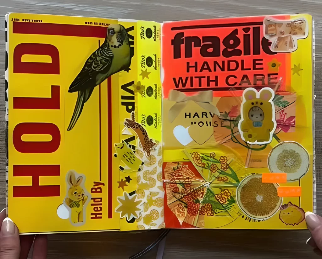
Steps to Achieve This Look:
Commit to the Palette: Choose one or two analogous (side by side on the color wheel) colors for maximum impact, such as the intense yellow and orange seen here. Ensure every piece of ephemera fits within this spectrum.
Establish Contrast: Use a solid block of color (the bright red orange) on one side and a busy, graphic image (the yellow page with the bird) on the other. This prevents the bright colors from overwhelming the eye.
Introduce Industrial Text: Use large, bold shipping labels or packing tape cutouts, such as the “FRAGILE” sticker or the “HOLD” stamp. These strong, clean lines provide structure to the busy colors.
Blend Textures: Combine hard, glossy surfaces (like vinyl stickers and warning labels) with organic, softer textures. Notice the inclusion of the dried citrus slices and soft fabric ribbonthey add a delicate element to the otherwise bold, graphic design.
Finish with Playful Accents: Layer in small, cute, themed stickers (the rabbit, the bear in a costume) to keep the page light and personal, preventing the industrial elements from becoming too severe.
11. The Ephemeral Daily Tracker
Forget sterile calendar layouts. Your calendar spread can be a vibrant, chaotic snapshot of your daily life, filled with the logos and proof of where you spent your time (and money).
Step by Step Guide:
Start with the Grid: Use a basic month at a glance layout as your foundation.
Save the Evidence: Throughout the month, collect small pieces of ephemera receipts from your favorite coffee shop (like “Gotham”), product stickers (like “Walgreens” or “Target”), or political stickers (“I Voted”).
Use Micro Collage: Instead of writing detailed entries, dedicate each day’s box to a tiny collage of the day’s key activity. For instance, if you bought books, use the small “Barnes & Noble” logo. If you had a sweet treat, use a product sticker (like the “Insomnia” logo).
Add Visual Weight: Anchor the layout with larger, evocative items like food stickers (the strawberries or orange slices shown) to fill negative space and enhance the month’s mood.
12. Interactive Travel Spreads: Lift the Flap Memorie
Travel journals should feel immersive and exciting. Create dimension and surprise by hiding personal photos or secret notes underneath larger decorative elements.
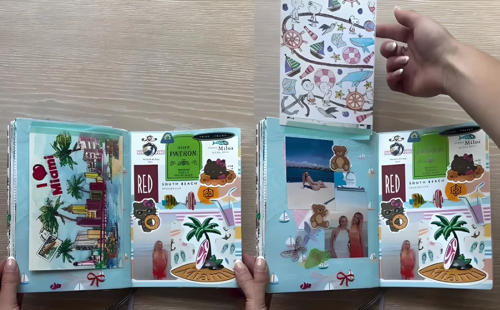
Step by Step Guide:
Establish the Base: Choose a vibrant, themed background like a light blue pattern depicting ocean waves, boats, and surfboards.
Layer the Setting: Place large, non personal graphics onto the spread first. Here, the artist uses layered stickers of the “I Love Miami” skyline and large, colorful brand logos (like “Silver Patron”).
Create the Flap: Designate a section for a hidden element. In the example, a brightly illustrated booklet (perhaps a folded map or brochure) is secured only at the top edge.
The Reveal: Tuck your personal photographs like candid beach snapshots under the flap. When you lift the colorful cover, a curated display of memories is revealed, adding a wonderful element of discovery.
13. Thematic Nightlife and Dining Documentation
If you are documenting a special event or a glamorous night out, use a unified color palette and texture to instantly set the mood for the entire spread.
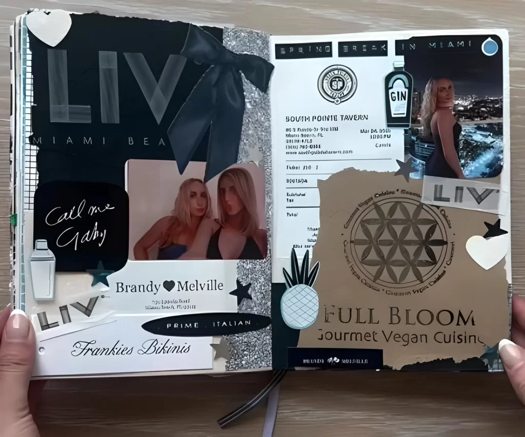
Step by Step Guide:
Define Your Palette: Select a dark, dramatic color scheme (like black, charcoal, white, and silver glitter) to capture the atmosphere of a chic venue or club.
Incorporate Texture: Use varied materials to add depth. Include matte black cardstock, shiny silver glitter accents, and a contrasting piece of natural kraft paper (like the background used for the “Full Bloom” logo).
Anchor with Typography: Use large, bold logo cut outs (like the “LIV” club logo) or stylized typography to dominate the page and identify the location instantly.
Integrate Ephemera Seamlessly: Instead of simply taping a receipt down, integrate it into the design by placing it next to high quality photos and matching the overall aesthetic. Notice how the “South Pointe Tavern” receipt is balanced against the large image on the right.
14. Tactile Map & Patch Layouts
Give your travel spreads a tactile, almost souvenir like quality by incorporating physical textures like embroidered patches and map cut outs.
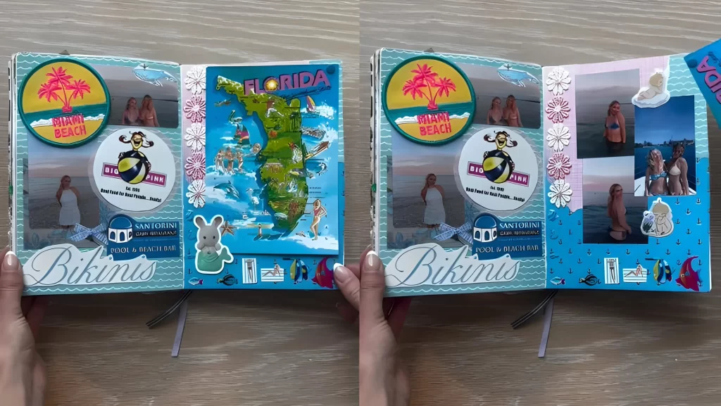
Step by Step Guide:
Focal Point Map: Cut a map of the region you visited (like the brightly colored Florida map) and make it the central element of the page. This immediately grounds the location.
Add Fabric Texture: Attach embroidered patches (like the “Miami Beach” patch shown) using strong glue or stitching. These three dimensional items instantly make the spread feel more substantial.
Layering with Logos: Place circular, recognizable restaurant logos (“Big Pink,” “Santorini”) around the map, making sure they overlap the background slightly to create depth.
Hide and Reveal Photos: Continue the interactive theme by creating small pockets or securing only the top edge of a photo stack. Lift the map or a decorative element (like the flower strip) to reveal a hidden grid of related images underneath.
15. Functional Trackers with Secret Pockets
Junk journals don’t just hold memories; they can hold goals and tracking systems too. Merge the functional nature of a tracker with the element of surprise by creating discreet pockets.
Step by Step Guide:
Design Your Tracker: Create a large, appealing tracking system, such as the colorful bookshelf shown, which tracks books you have read or intend to read.
Create a Dedicated Pocket: On the facing page, utilize a large piece of decorative paper here, a cheerful pink gingham pattern to construct a spacious pocket or fold out flap.
Secure the Mechanism: Ensure the flap or pocket can be easily opened. In the example, a small paper clip or piece of tape (hidden by a small sticker) keeps the pocket closed.
The Secret Contents: Use this functional pocket to store more intimate notes, private reflections on the books you read, small pieces of ephemera related to your reading environment, or small photos relevant to the tracked activity.
16. The High Contrast Brand Aesthetic
This technique focuses on creating a sophisticated, often monochromatic look centered around a specific brand or visual style that inspires you.
How to Create This Spread:
Choose Your Vibe. Select a brand or a repeating aesthetic (like Y2K, Grunge, or Mod) that relies heavily on a limited color palette such as black, white, and maybe one metallic accent.
Embrace Pattern. Use bold, contrasting patterns like checkerboard or stripes as your background or layering element. These patterns anchor the entire composition.
Layer the Logos. Gather printouts or clippings of your chosen brand’s logo in various fonts and sizes. Curve the text or place it over crumpled paper to add texture and movement.
Add Unexpected Elements. Introduce small metallic items like stars or even physical hardware, such as a large safety pin, to provide a touch of punk or industrial texture against the paper layers. This contrast elevates the design from a simple scrapbook page to a true aesthetic statement.
17. Designing an Interactive Product Showcase
Why just stick a picture down when you can make a piece of your journal functional? This idea centers around showcasing a product or item in a visually rich, interactive way.
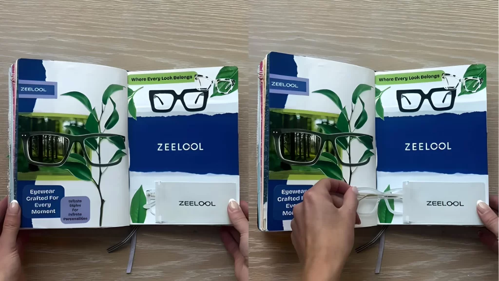
How to Create This Spread:
Establish Your Scene. Choose a rich background color (like deep blue) and introduce natural elements (like cutouts of green leaves or vines) to provide contrast and depth, making your product pop.
Use Scale. Feature your product (in this example, a pair of glasses) prominently and in large scale on both pages. Reflective or shiny paper works excellently here to simulate the lens effect.
Build a Functional Pocket. Dedicate a section to creating a flap, pouch, or pocket. This requires precise cutting and gluing to ensure the pouch is sturdy.
Insert a Miniature Element. The “magic” of this layout is using the pocket to store a tiny version of the item you’ve featured perhaps a small paper cutout, a miniature plastic toy, or even a folded note related to the product. It gives the reader something to physically interact with.
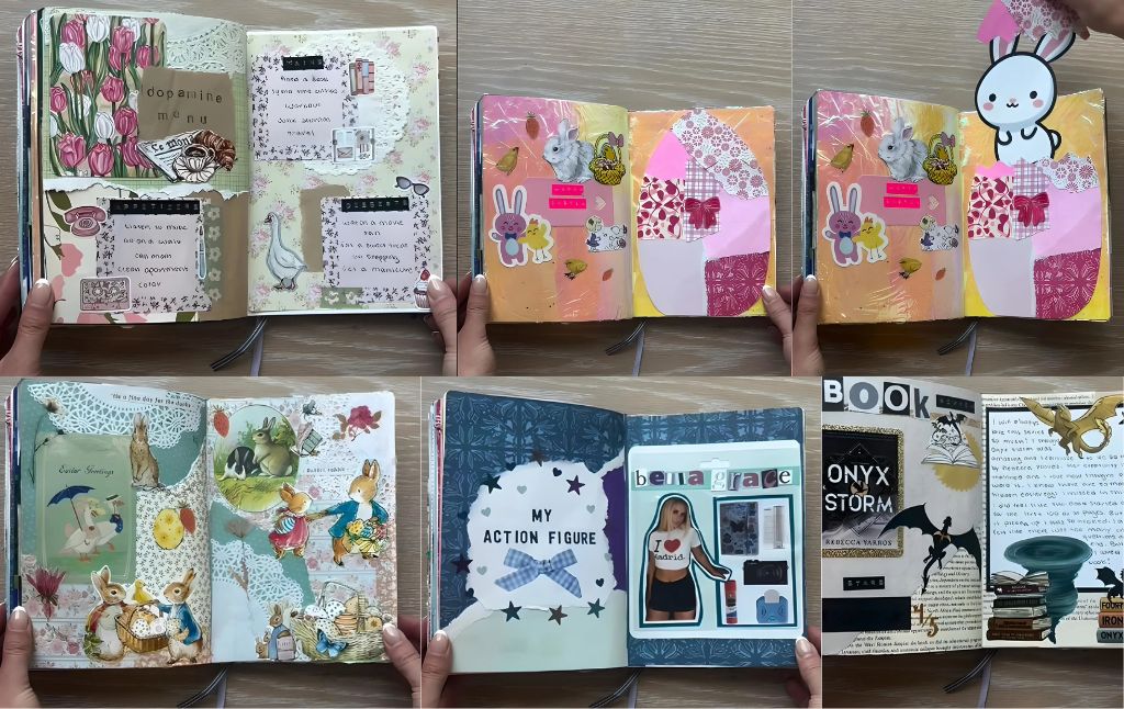
18. Crafting a “Custom Action Figure” Miniature World
Turn a personal hero, friend, or even yourself into a collectible toy with this nostalgic and clever journal spread that mimics toy packaging.
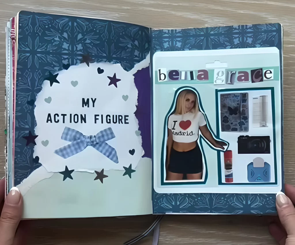
How to Create This Spread:
Design the Packaging Backdrop. Choose a heavily patterned or textured paper for the background to simulate the cardboard backing of a collectible toy package. Cut out a large, irregular shape (like the scalloped white cloud shown) to focus attention.
Cut Out Your Figure. Find a picture of the person or character you are memorializing and carefully cut out their silhouette. Mount them centrally on the page.
Create the Blister Pack. Instead of real plastic, use a square of clear acetate, vellum, or heavy cellophane. Glue down the edges of this “pack” to the journal page, ensuring the bottom edge remains open.
Fill the Pack. This is where the personalization comes in. Gather miniature stickers, tiny paper cutouts, small pieces of glitter, or even tiny pictures that represent the figure’s personality and hobbies (like a camera, glue stick, or butterfly stickers). Place these inside the clear “blister pack” pouch.
19. Building a Pop Art Food Themed Collage
This layout uses repetition, bold colors, and strong typography to celebrate a single food item, often taking inspiration from classic Pop Art posters.
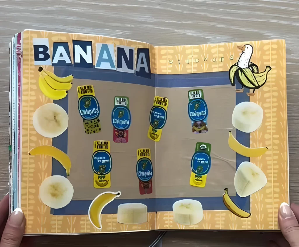
How to Create This Spread:
Choose Your Subject and Background. Select a vibrant food item (like a banana, an apple, or a piece of candy). Use a complementary, muted color for the background a simple brown kraft paper or textured print works well to make the bright colors pop.
Go Big with Typography. Cut out huge block letters (or use stickers) to spell out the name of your food item across the top of the spread. Ensure the letters overlap or are slightly imperfect to maintain that junk journal feel.
Repetition is Key. This layout thrives on repetition. Use multiple cutouts of the food item in different states (whole fruit, sliced fruit). Most importantly, collect and repeat product labels (like the Chiquita stickers shown) across the center of the spread to create a grid like pattern.
Add Whimsy. Include one element of humor or surprise, such as a cartoon character related to the food or a small drawing that breaks the symmetry.
20. Journaling Your Favorite Fantasy Novel Review
Turn your book reviews from simple notes into elaborate, immersive spreads that celebrate your literary obsessions.
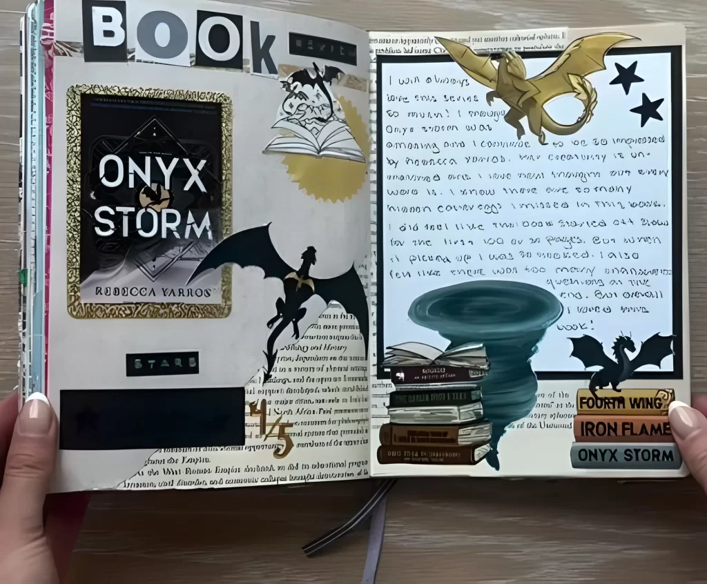
How to Create This Spread:
Focus on Imagery and Text. Dedicate one side to imagery and titles, and the other side to your handwritten review. Use text excerpts from the book or relevant encyclopedia pages as a subtle background layer for texture.
Incorporate Key Visuals. Mount the book cover (or a portion of it) prominently. Since this is a fantasy spread, include powerful imagery related to the genre dragons, swords, or magical symbols.
Use Thematic Colors. Stick to colors that evoke the atmosphere of the book. For high fantasy, browns, sepia tones, blacks, and metallic golds work perfectly.
Layer and Cluster. Create a visual focal point, such as a stack of tiny book cutouts or a whirlwind image, and layer the key words and imagery around it. This clustering technique makes the spread look rich, storied, and full of hidden details just like the novel itself.
21. Design a Dopamine Menu (Appetizers, Mains, & Desserts)
Turn your self care list into a beautiful, functional layout inspired by a vintage café menu. This spread is not only visually stunning but serves as a gentle reminder to prioritize activities that bring you joy.
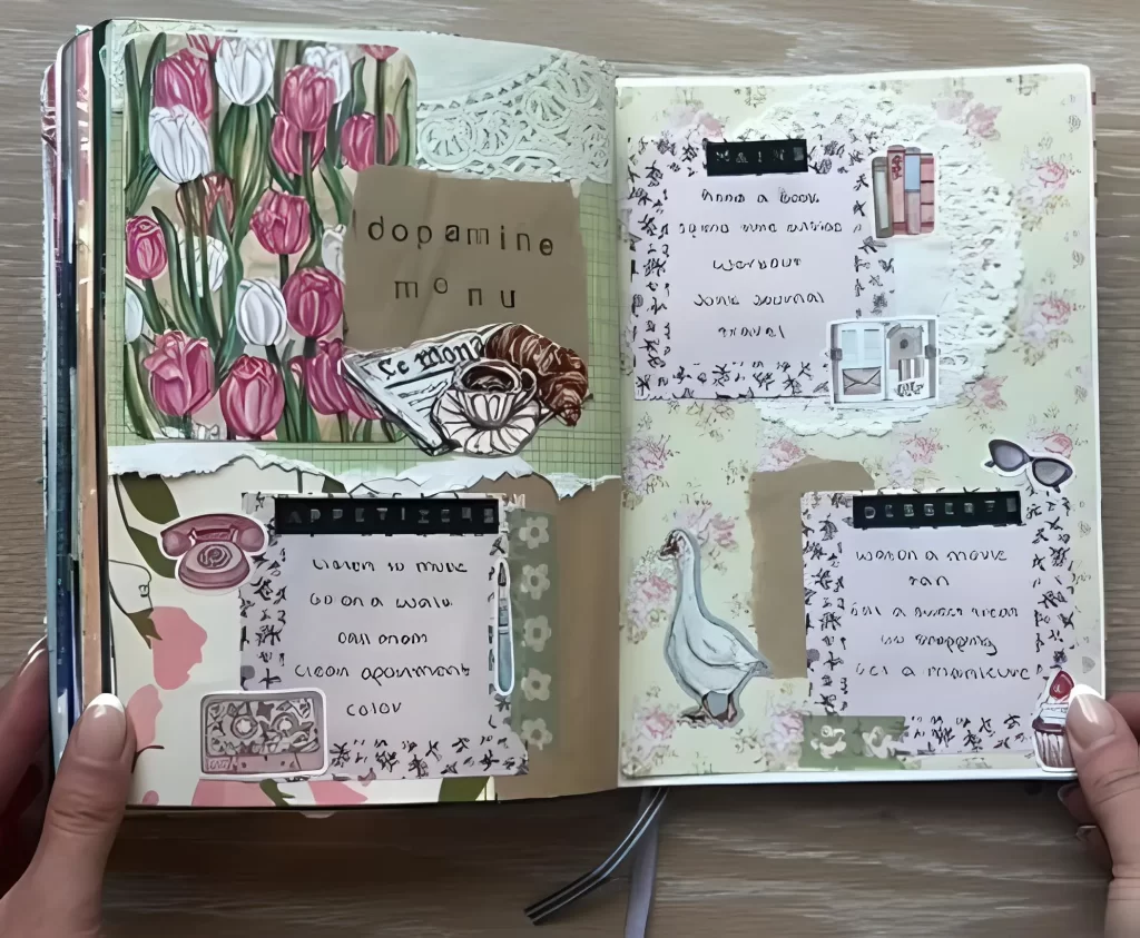
How to Create This Spread:
Set the Mood: Start with a gorgeous, high impact background piece. If you love florals, use a lush, detailed paper cut to fit half the page.
Define Your Sections: Title the spread “Dopamine Menu.” Use torn kraft paper or repurposed envelopes to create three distinct pockets or areas, labeled “Appetizers,” “Mains,” and “Desserts.”
Add Visual Texture: Layer in feminine elements like paper lace doilies, small pictures of treats (like croissants or coffee cups), or pieces of fabric to define the edges of your sections.
List Your Joys: Write out your self care activities onto cardstock and glue them into the corresponding sections (e.g., “Listen to music” in Appetizers; “Read a book” in Mains; “Eat a sweet treat” in Desserts).
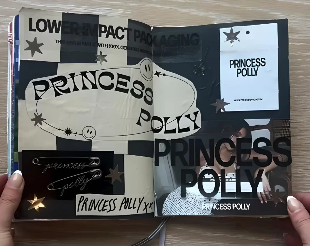
22. Embrace Maximalism with a Brand Themed Collage
Don’t shy away from incorporating packaging, magazine clippings, or large corporate logos if they speak to you! This technique allows you to capture a specific aesthetic, color scheme, or craving that you’re currently enjoying.
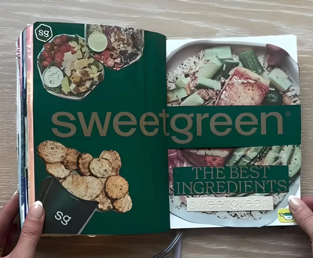
How to Create This Spread:
Choose Your Focus: Select a favorite brand or product that has strong design elements (like a bold color and unique font).
Go Green (or whatever color you choose!): Use the packaging itself as the main foundation for your spread. If you’re using a dark green theme, cover the pages entirely in that color.
Use Bold Text: Cut out the largest version of the brand name you can find and use it as a striking, horizontal element across the center gutter of the journal.
Layer Product Shots: Cut out images of the actual product (food, clothing, ingredients) and layer them around the main text. Use smaller logos or stickers to anchor the corners. This creates a deeply cohesive, immersive spread.
23. Include Hidden Surprises with an Event Pop Up
Junk journals thrive on interaction. If you have an event flyer, a concert ticket, or even a coloring page you love, incorporate it as a lift up flap to conceal private thoughts or smaller mementos.
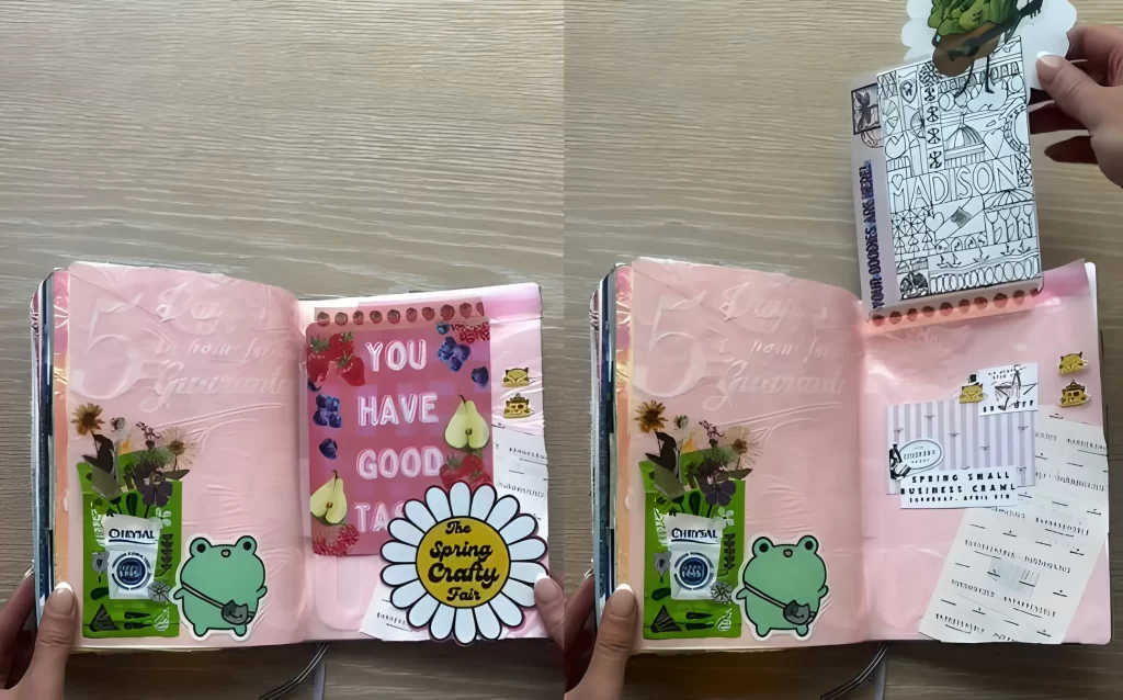
How to Create This Spread:
Create a Vibrant Base: Use paint, iridescent film, or bright paper scraps to establish a bold foundation (pink works beautifully here).
Layer Mementos: Glue down ticket stubs, small flyers (like “The Spring Crafty Fair”), and favorite stickers (like the charming frog) to build the main composition.
Attach the Flap: Take your chosen surprise item (a small card or coloring page) and attach it only along the top edge of the spread using strong adhesive tape or a small strip of decorative washi tape, forming a hinge.
Reveal the Hidden Space: When the flap is lifted, you can tuck handwritten journaling, tiny paper scraps, or photos into the space beneath it.
24. Craft a Dimensional Pop Up Character
Give your journal depth by adding a simple, dimensional element that moves when you turn the page. This technique requires just a tiny bit of hidden hinging.
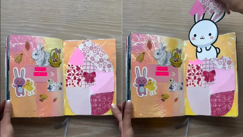
How to Create This Spread:
Build the Scene: Start with a cheerful background, perhaps blended colors or vibrant pastels.
The Patchwork Element: Cut a large, simple shape (like an Easter egg or a balloon) and decorate it using small, mismatched scraps of patterned paper. Glue this firmly to the page.
Create the Character: Cut out a whimsical character (like a cute bunny or a bird) and attach a very small paper hinge (a strip of cardstock folded in two) to its back.
The Reveal: Glue the bottom of the hinge only to the page, positioning the character so it stands upright and slightly lifts away from the surface. When you flip the page, the character appears to pop up and greet you!
25. Curate a Unified Vintage Ephemera Collage
If you love the classic, cozy look of vintage illustrations, create a unified spread by strictly adhering to a specific theme and a limited color palette.
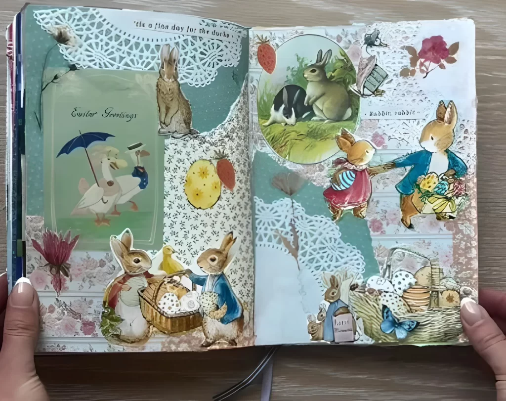
How to Create This Spread:
Choose Your Theme & Palette: Select an aesthetic (such as vintage children’s books or nature studies). For this look, focus on dusty blues, soft sage greens, and faded rose pinks.
Use Lace as a Unifier: Cut white or cream paper doilies into sections and place them strategically on the page. These act as beautiful, intricate frames for your main images and give the spread a delicate texture.
Layer Illustrations: Select classic paper cut outs, like illustrations of rabbits, birds, or antique roses. Arrange them dynamically, allowing them to overlap the doilies and the background paper for depth.
Add Text: Include small phrases or sweet quotes (like “It’s a fine day for the ducks”) on small pieces of aged paper to complete the vintage storytelling aesthetic.
15 Inspiring Styles to Kickstart Your Next Junk Journal Spread
10 Interactive Junk Journal Ideas to Bring Your Pages to Life
10 Inspiring Junk Journal Spreads to Try Today
Create a Spooktacular Light Up Halloween Card: A Step by Step Guide
How to Craft a Stunning Autumn Leaf Bowl
A Spooktacular DIY Jack Skellington Lantern
Create Stunning DIY String Lanterns
How to Make a Spooky Halloween Jar Lantern
Seven Pumpkin Creative Painting Ideas for Halloween!
3 Creative No Carve Pumpkin Painting Ideas for Halloween
3 Creative and Unique Pumpkin Carving Ideas for Halloween