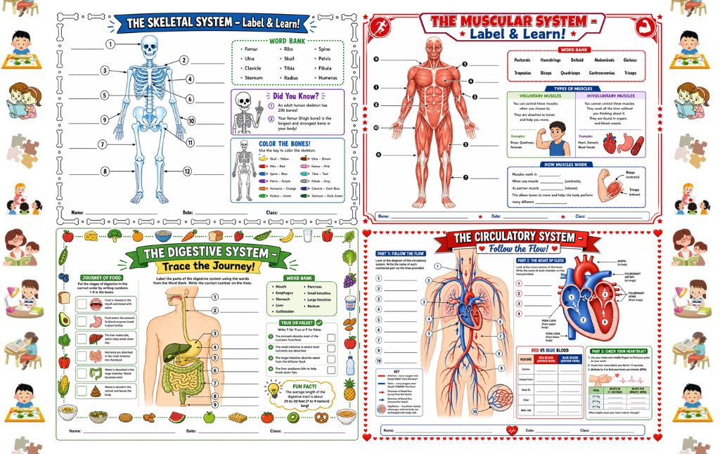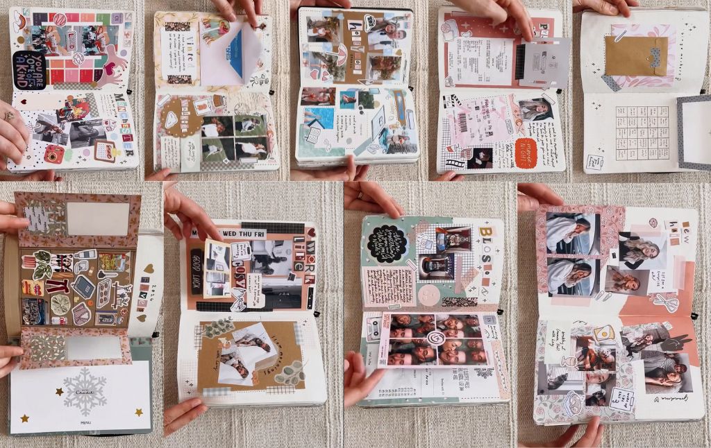
This is not just one journal page, but a beautiful showcase of several richly layered, interactive spreads from your personal journal!
You have clearly mastered the art of junk journaling, using layered paper, integrated memorabilia, and clever folding techniques to capture your memories.
Looking through these pages is like flipping through a personalized archive. Here is a page by page analysis of the distinct styles and techniques you employed across these incredible spreads.
1. The Theatrical Memory Spread (Pink & Green Collage)
This spread, themed around a theatrical experience (likely Wicked given the Elphaba and Glinda cutouts), is a masterclass in collage and hidden elements.
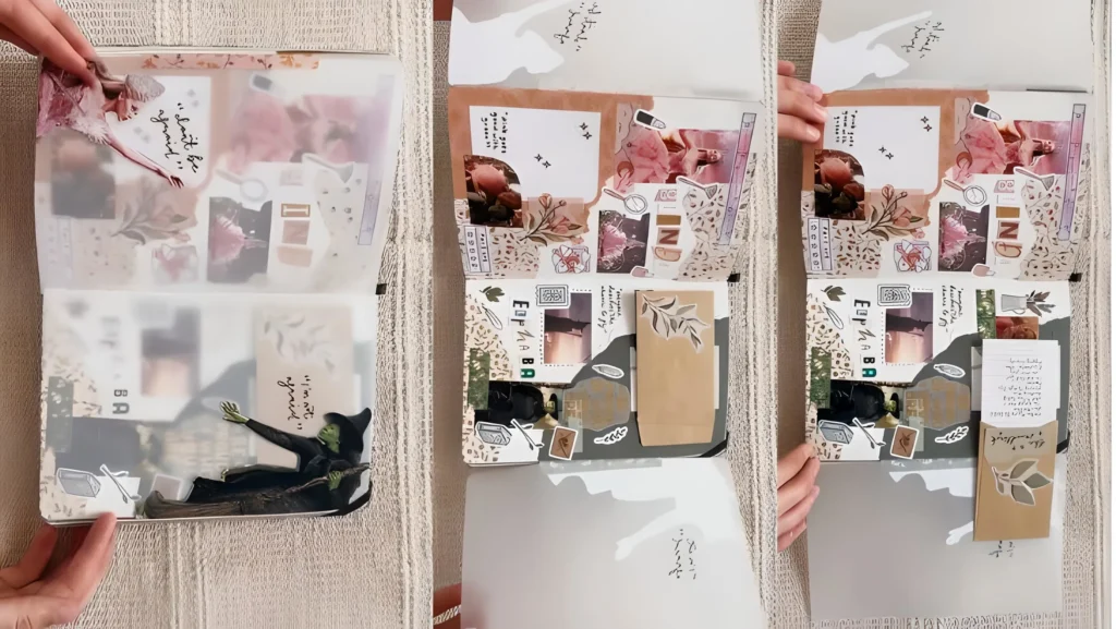
Layered Aesthetics: You established a warm, romantic aesthetic using muted pink floral papers, contrasted with deep greens, olive tones, and dark vintage images (like the withered floral design).
Vellum Overlay: A key technique here is the use of vellum or clear acetate sheets. You affixed a semi transparent sheet over the collage on the bottom page. This protects the delicate elements and adds a sophisticated, blurry depth while keeping the elements underneath visible.
Pocket Integration: You integrated a small, functional kraft paper envelope on the bottom right. This pocket is perfect for holding small, handwritten notes, tickets, or ephemera related to the experience. You pulled out a small piece of journaling that was previously hidden inside.
Thematic Cutouts: The large, striking cutouts of the Witch and Glinda are the centerpiece, instantly defining the theme and adding dynamic energy to the page.
2. The Birthday Celebration Spread
This page beautifully documents your birthday using cohesive colors and functional space.
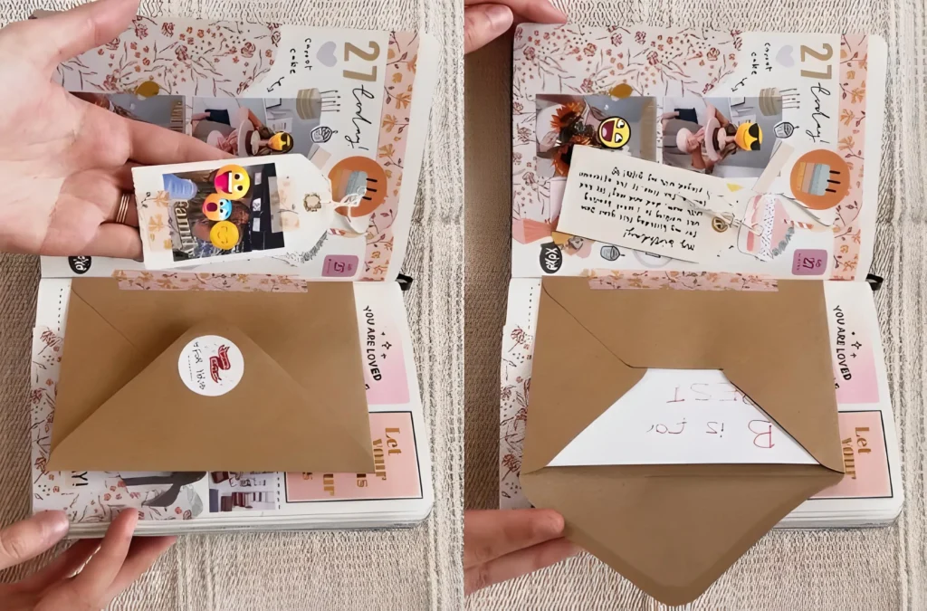
Cohesive Palette: You used soft pink and peach floral patterns as the primary background, instantly conveying a light, celebratory mood.
Visual Storytelling: You clustered two key photos at the top, showing moments from your day (flowers, cake).
Integrated Journaling: Instead of writing a large block of text directly on the page, you wrote a brief description of the day on a small tag tied with twine. This tag is tucked neatly under the photos, making the journaling brief, sweet, and tactile.
The Envelope Pocket: Like the theatrical spread, you included a large kraft paper envelope sealed with a sticker. This is the perfect practical solution for storing bulkier souvenirs like receipts, birthday cards, or tickets without making the page bulky.
3. The Detailed Dining Spread (Food Collage)
This page shows how you effectively document an experience focused entirely on culinary delights, blending structure with collage.
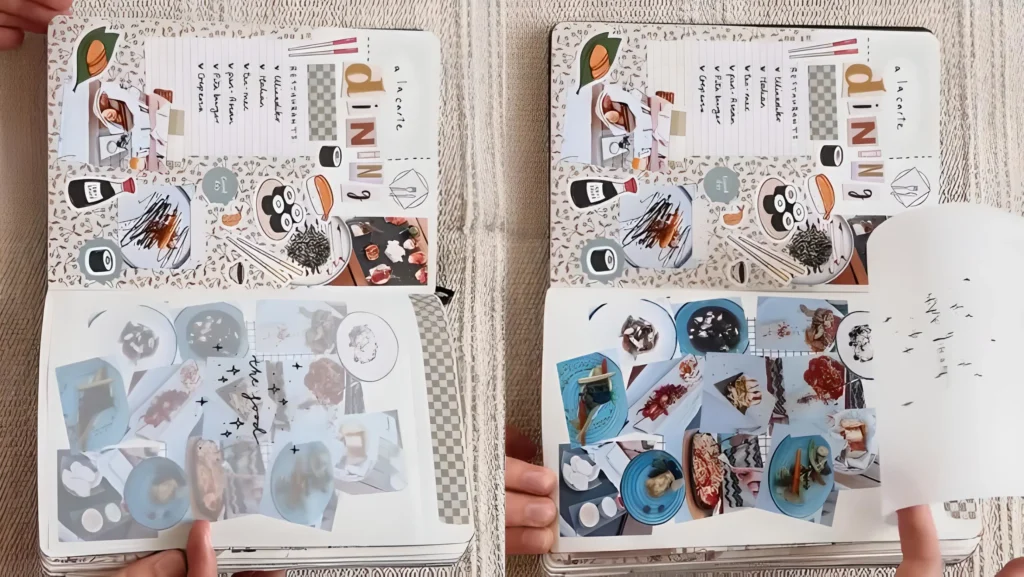
Structured List: On the left page, you maintained a clean, organized look by integrating a lined notebook paper background under your elements. You used this space to create a tidy checklist of the restaurants or dishes visited.
Dense Collage: The bottom right page is dominated by a dense, vibrant collage of food images (sushi, plates of food, chopsticks). These images appear to be printed on sticker paper and intentionally layered on top of each other.
Pull Out Journaling: You cleverly added a pull out tab or flap beneath the food collage. When lifted, it reveals a hidden space for extended journaling or detailed notes about the dining experience.
Decorative Headings: You used cut out block letters to spell out “dininG” on the right side, showing how simple letter stickers can create an eye catching, informal title.
4. The Night Out Spread: Receipts, Memories, and Reservation Notes
This spread brilliantly combines documentation of a social night out with a subtle color scheme.
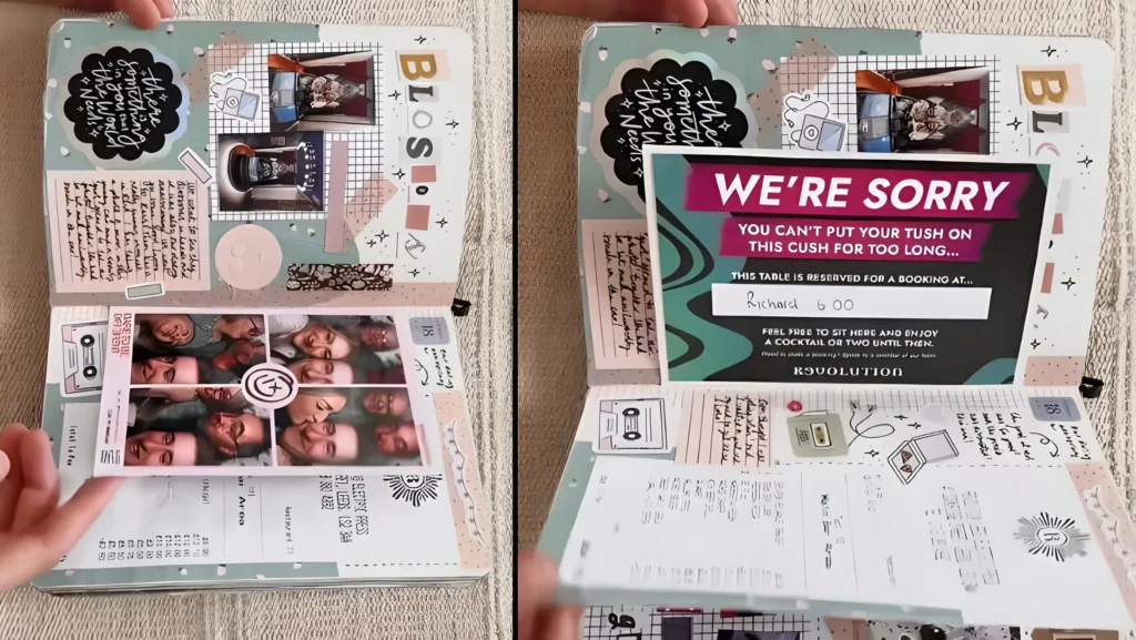
Left Page: Capturing the Vibe & Photos
Background & Texture: You used a light, speckled or subtly patterned background, enhanced with geometric washi tape (squares and triangles) in soft, muted pinks and browns.
Journaling Corner: You created a dedicated space for handwritten reflection in the top left, framed by a cloudy speech bubble sticker (“There is something the world needs…”). This area is reserved for reflective thoughts about the night.
Photo Strip Focus: The centerpiece is a photo booth strip or a sequence of group photos, which you adhered horizontally across the middle. This immediately gives the page a fun, collective energy.
Integrated Memorabilia: Below the photo strip, you placed a long, folded receipt. This is a crucial junk journal technique: integrating the physical proof of the night (like a dinner bill) directly onto the page.
Right Page: The Dramatic Reveal
Thematic Memorabilia: You used a large, eye catching card (“WE’RE SORRY, YOU CAN’T PUT YOUR TUSH ON THIS CUSH FOR TOO LONG…”) from the venue. Placing this high on the page makes it a striking focal point.
Hidden Receipt Flap: The long receipt from the left page folds under the right page, becoming an interactive element. You lifted the corner of the receipt to reveal the cost breakdown and other handwritten details, proving that even mundane documents can be a functional part of the design.
Cohesive Detailing: You scattered small, thematic stickers a cassette tape, a simple heart, and tiny written notes to link the two sides and fill the white space.
5. The Fashion & Interior Spread: Mood Boards and Hidden Aesthetics
This spread functions beautifully as a mood board, combining fashion, aesthetic imagery, and personal journaling.
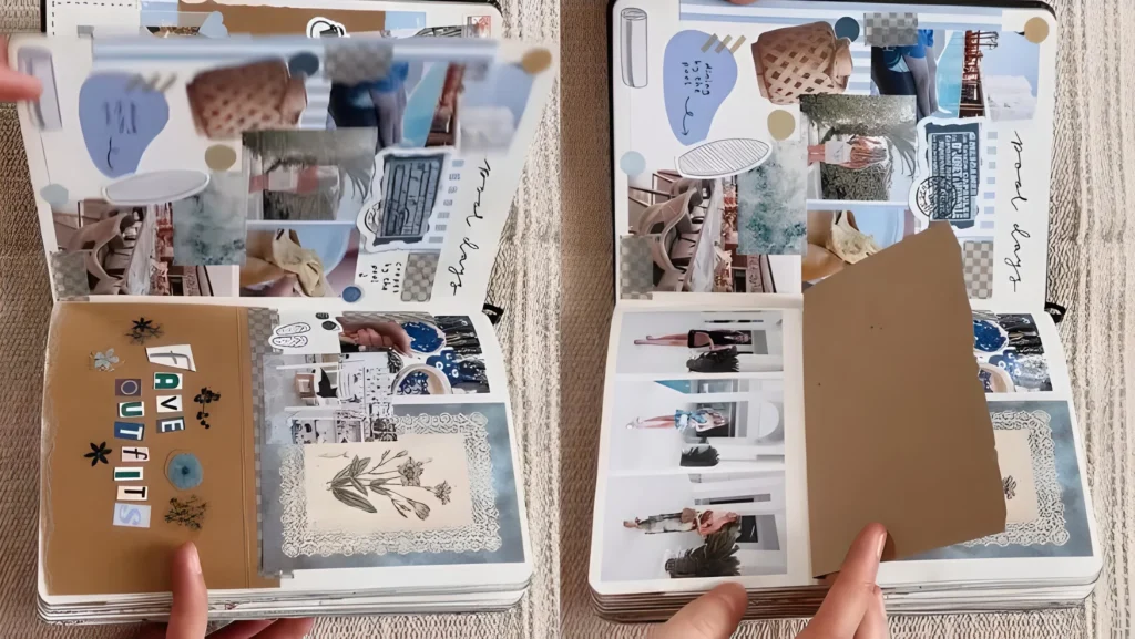
Upper Page: Aesthetic Photo Cluster
Blue Tones: The aesthetic here leans heavily on muted blues and creams. You created a visual cluster of blue toned photos and magazine cutouts (baskets, water, architecture).
Journaling Shapes: You used abstract shapes (ovals, circles) in solid blue and white to frame short handwritten notes, creating a clean, modern feeling. The heading “good days” sets a reflective tone.
Integrated Ephemera: You included stamped labels and vintage style stickers to enhance the mood board effect.
Lower Page: Outfits and Hidden Details
Photo Reveal Flap: The main feature here is a large, brown kraft paper flap positioned centrally on the bottom page. This flap is titled “F A V E OUTFITS” using playful block letters and stickers.
Hidden Photos: When the flap is lifted, it reveals a clean grid of photos showing various outfits and style moments. This structure neatly contains a large amount of visual information, making the reveal satisfying.
Nostalgic Details: You integrated a vintage botanical print (blue lace paper) into the bottom right corner, softening the look of the photo grid and adding a nostalgic touch.
6: Vintage Vows and Hidden Views (Betty & Program / Short Story)
This layout uses monochrome photos and rustic textures, anchored by a dramatic, multi-layered reveal.
Left Page: Setting the Monochrome Scene
Establish the Vintage Base: You began with paper featuring rough, torn edges (red brown and tan) layered over the background. This instantly creates a rustic, aged aesthetic.
Thematic Journaling: You integrated small sections of lined, patterned paper, which you used for brief, neat journaling in the top left corner, labeled with “Betty and Program.”
Monochrome Photo Cluster: You clustered several black and white photos tightly together, using washi tape and script elements as frames. The monochrome palette unifies the visual story.
Anchor the Flap: You anchored a large piece of kraft paper near the center bottom. This piece, which you titled “SHORT STORY” using individual block stickers, is designed to be the cover for your interactive element.
You added a decorative die-cut frame around a central image of a dog (likely “Leley” or “Leaf,” given the text seen elsewhere).
Right Page: The Interactive Reveal
Hidden Photo Grid: When the “SHORT STORY” flap is lifted, it reveals a structured grid of photos underneath. The photos are clean and evenly spaced, contrasting nicely with the busy collage above.
The Vellum Overlay: You brilliantly placed a sheet of semi-transparent vellum or acetate over this photo grid.
This vellum is not just protective; it has a subtle grid pattern or checklist printed on it, allowing you to layer notes or planning elements (like a “featuring Leaf” timeline) directly over the pictures without damaging them.
Cohesive Detailing: You completed the spread by framing the entire bottom section with patterned washi tape that mimics a black and white checkered border, bringing structure to the edge of the page.
7: Rosy Routines and Sweet Surprises (HEW / Grandma)
This spread is a celebration of cozy, domestic life, using soft pinks and creams, structured photo grids, and a very clever peek a boo mechanism.
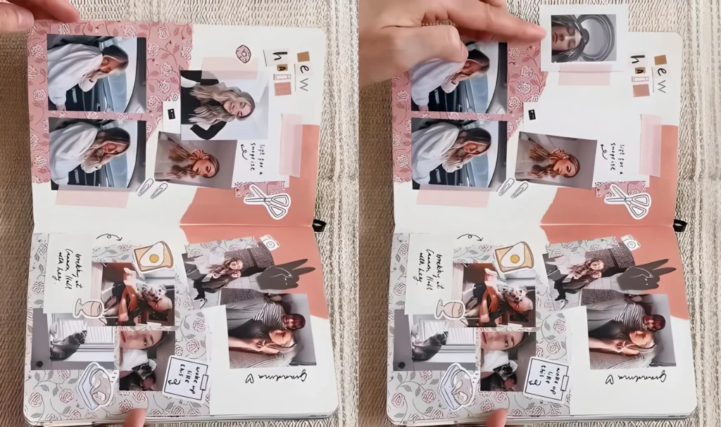
Upper Page: Structured Portraits and Hidden Notes
The Soft Palette: You utilized a dusty rose and soft pink floral background, creating an immediate sense of warmth and comfort.
Photo Grid: You created a structured grid, aligning four portrait style photos vertically on the left side, framed by rose patterned washi tape.
Layered Background: You layered strips of solid pink and textured paper behind the images on the right side, giving the arrangement depth. You also added the playful block letters “h e w” (perhaps a nickname) as a cute heading.
The Peek A Boo Corner: This is the surprise! You took one of the top right photos and folded its corner over. When lifted, this flap reveals a tiny, personal detail underneath perhaps a small drawing, a hidden date, or a single meaningful word, hinting at the text “light for a surprise.”
Lower Page: Cozy Collage and Pet Focus
Thematic Clustering: The bottom section is dedicated to a dense collage of images representing home life, pets, and comfort (labeled “grandma ❤️”). You used a variety of small, cropped photos and placed them tightly together.
Visual Context: You integrated small, hand written notes and stickers (like the breakfast icon and makeup items) between the photos. This gives immediate, charming context to the visual elements, such as the note “breakfast at sunset with huy.”
Mixing Aesthetics: Even on a cozy page, you used clean lines and iconic stickers (like the scissors and paper clips) to give the page an organized, crafted feel, preventing the photo collage from feeling overwhelming.
8. The Planning & Progress Spread: Bingo, Checklists, and Hidden Notes
This spread is a great example of bullet journaling meets junk journaling, focusing on organization and future planning.
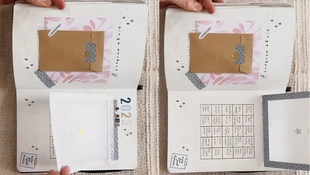
Left Page: Envelope and Photo Pocket
Functional Envelope: You used a small, kraft paper envelope, decorated with a pencil sticker and washi tape, and affixed it to the top half of the page. This is a practical pocket for storing loose notes, receipts, or small planner stickers.
Date Marker: You placed the current year (2026) vertically, using small block letter stickers, which serves as a subtle organizational marker for the spread’s content.
Hidden Photo Flap: On the bottom, you created a simple white square flap that lifts up. This is attached only at the top edge, allowing you to hide a photo, secret note, or additional writing underneath.
Right Page: The Goal Tracker
The Bingo Grid: The centerpiece is a hand drawn or printed grid, clearly labeled with the heading “bingo markers ” (suggesting a reading or goal tracking system). This provides a structured, visual way to mark progress against specific targets.
Interactive Folder/Flap: A small, folded white square with a star cutout is attached to the right side of the page, acting as another small flap. This can hide short pieces of journaling or reward stickers related to the bingo game.
Cohesive Detailing: You ensured the aesthetic consistency across both pages by using the same light floral paper pattern (behind the envelope) and scattering small, hand drawn starbursts and marks to fill the blank spaces.
9. The Holiday Treat Reveal Spread: Windows and Menus
This spread perfectly captures a cozy holiday experience, using flaps and acetate to create a delightful reveal.
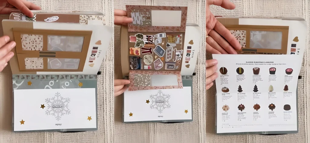
Top Flap: The Sticker Collection
Window Design: You created a top flap (attached at the spine) using kraft paper. This flap has several small windows cut into it, which you backed with clear acetate or vellum.
Hidden Storage: When the flap is lifted, the underside (now the visible page) is used as storage for flat stickers (kitchen tools, plants, clothes). The windows in the top flap allow you to see the stickers underneath, turning the flap itself into an interactive storage pocket.
Bottom Page: The Menu Reveal
Thematic Background: The bottom page uses a festive, patterned background (light green with stars and snowflakes).
Sliding Menu Flap: You created a cover flap (with the snowflake and “MENU” text) that lifts up to reveal a detailed printed sheet underneath. This is clearly a menu or guide from a chocolate shop (Hotel Chocolat), capturing a specific holiday treat experience.
Detailed Memorabilia: The menu itself is integrated, offering detailed descriptions of the Christmas chocolates. This is a brilliant way to include bulky, informational souvenirs without pasting them awkwardly onto the page.
10. The Festive Christmas Collage Spread: Photos and Pockets
This spread is pure holiday joy, utilizing a high density of festive imagery, photos, and a strong red-and-green color scheme.
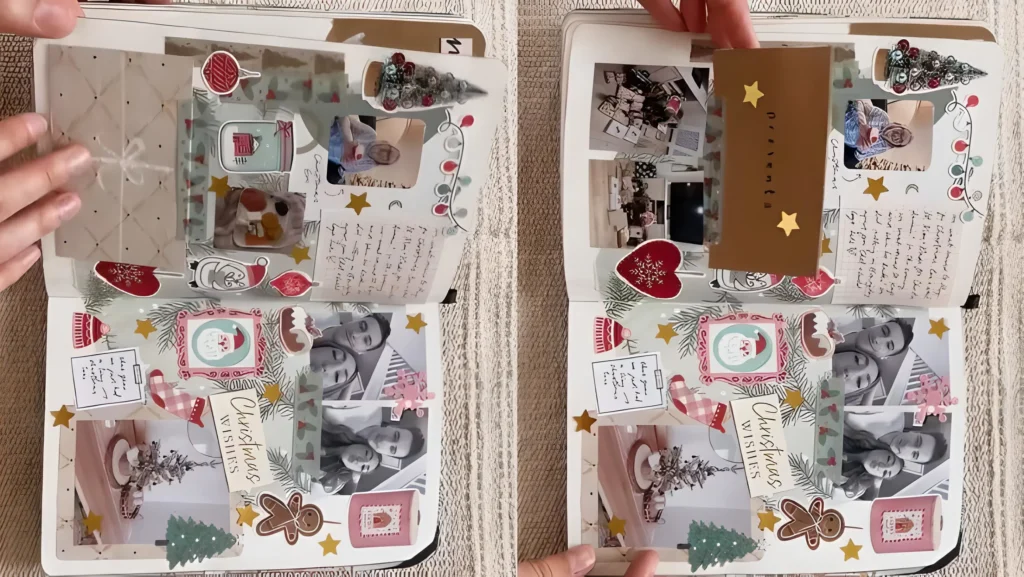
Left Page: Layered Images and Journaling
Christmas Aesthetic: You used vibrant Christmas colors and patterns (red gingham, fir branches, snowmen stickers).
Photo Overlays: You strategically placed small photos over festive cutouts (like the fireplace or wrapped gifts), allowing the photo to blend into the overall holiday scene.
Hidden Note Flap: You created a small, folded kraft paper flap near the top right of the page, secured by a ribbon and wax seal sticker. This is used to hide a private journaling entry or a detailed account of the Christmas event.
Integrated Vellum: A piece of vellum is folded over the entire left page, protecting the delicate collage and adding a soft layer over the busy arrangement.
Right Page: Photo Grid and Pockets
- Monochromatic Balance: To balance the color explosion on the left, you used black and white photos of people in the bottom right, which visually grounds the page.
- Thematic Stickers: You used oversized, recognizable holiday stickers like a gingerbread man, Christmas trees, and large “Christmas Wishes” labels to frame the photos.
- Hidden Photo Flap: You created a small, rectangular brown flap near the top right, labeled with “ornament.” This flap lifts to reveal another small photo underneath, adding an extra layer of discovery.
11. The Work Life Balance Spread: Routine and Relaxation
This spread tackles the reality of daily life, using a combination of structure and casual collage to represent work and downtime.
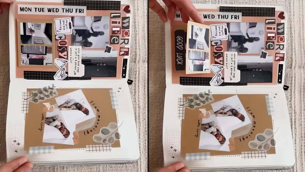
Upper Page: Structure and Work Focus
Work Schedule Header: You established structure using a bold sticker strip labeled “MON TUE WED THU FRI,” emphasizing the daily grind.
Structured Grid: Photos documenting your work life (desk setup, office interactions) are placed in a clean, black-framed grid.
Layered Text and Quotes: You layered block letters (“WORK LIFE”) and small slips of paper with reflective journaling (“Is a holiday needed?”) over the photos, blending narrative with the visual evidence of your routine.
Interactive Flap: You included a small, attached flap labeled “GOOD LUCK.” This lifts to reveal a small hidden photo or note, offering a moment of encouragement or a secret detail about your workday.
Lower Page: Downtime and Relaxation
Warm Aesthetic: The bottom page shifts to a warmer, softer aesthetic with kraft paper, botanical stickers (eucalyptus leaves), and a hand-written title, “slow mornings.”
Organic Collage: Photos showing relaxation (cuddling, napping) are arranged more organically, overlapping the kraft paper and background elements to convey a relaxed mood.
Integrated Journaling: Small handwritten snippets and abstract geometric stickers frame the images, documenting the enjoyment of quiet, slow moments away from the work schedule documented above.
12. The Cinema Night Spread: Receipts, Movies, and Retail Therapy
This spread brilliantly captures a fun night that combines shopping, movie time, and cozy leisure, all tied together with pink, red, and brown tones.
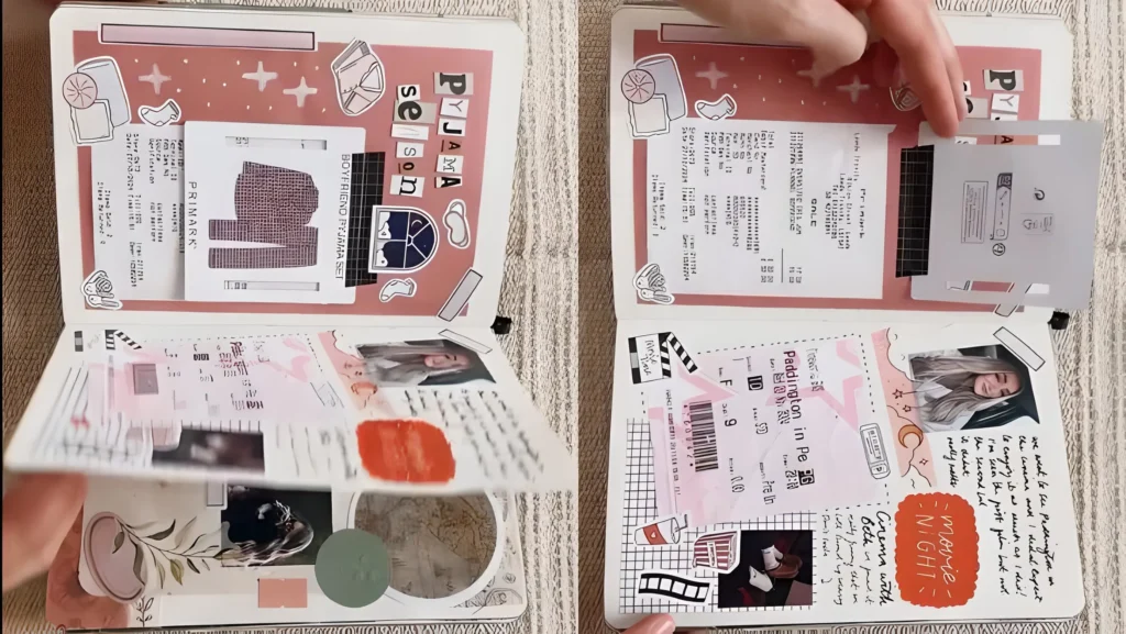
Upper Page: Retail and Cozy Prep
- Aesthetic Header: You used a background of light, peach-toned paper and framed the top with stickers and patterns, including a section titled “PYJAMA SEASON.”
- Integrated Receipts: The dominant feature is the integration of physical receipts (one from Primark, the other from Starbucks), which you anchored horizontally. This is classic junk journaling turning proof of purchase into artistic texture.
- Hidden Details: A small piece of washi tape or a sticker tab is folded over one receipt. When lifted, it hides or reveals additional handwritten notes or details about the items bought.
Lower Page: Movie Night and Nostalgia
- Thematic Tickets: You prominently featured the cinema ticket (“Paddington in Peru”), which you placed diagonally over a gridded background. This immediately grounds the memory.
- Journaling and Photo Placement: You created a dedicated journaling space on the right, labeling the theme “MOVIE NIGHT” with a striking orange, cartoonish speech bubble. A main portrait photo balances the ticket on the left.
- Interactive Photo Flip: A small, folded square flap is positioned in the lower left corner. This flap lifts to reveal additional photos or handwritten quotes underneath, adding a fun, peek a boo element.
- Cinema Detailing: You decorated the margins with small, thematic stickers like film reels, popcorn, and soda cups, adding charming context to the movie theme.
13. The Vacation Mood Board Spread (Holiday)
This bright, summery spread functions like a travel mood board, using collage and clean checklist organization.
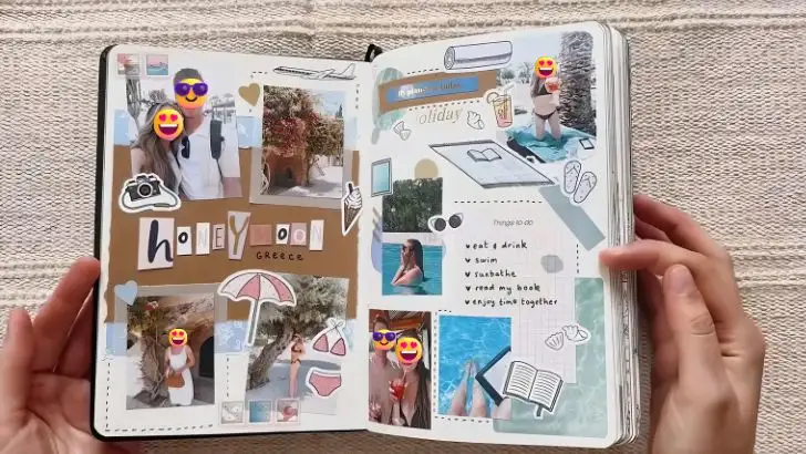
Upper Page: The Photo Header
- Vibrant Background: You used a warm, sunny brown kraft paper background in the upper half.
- Photo Cluster: You clustered several small, sun-drenched photos, emphasizing the holiday theme (cocktails, food, selfies).
- Bold Title: The page is clearly titled “H O L I D A Y” using bright, playful block letters, making the page’s theme instantly recognizable.
Lower Page: Clean Organization and Water Elements
- Journaling Checklist: The lower half contrasts the busy collage above with clean organization. You used lined paper to create a checklist or list (“Visit a park,” “read a book,” etc.), likely documenting activities completed or goals for the trip.
- Watery Aesthetic: The bottom background is set against a light blue, wave-like pattern, reinforcing the feeling of being near the ocean or pool.
- Embedded Photo: A photo of someone relaxing in the water is perfectly placed to overlay the checklist and the blue background, visually integrating the activity list with the memory.
14. The Fashion & Style Spread (Vinted)
This spread focuses on documenting style and fashion purchases, using a blend of floral and vintage elements.
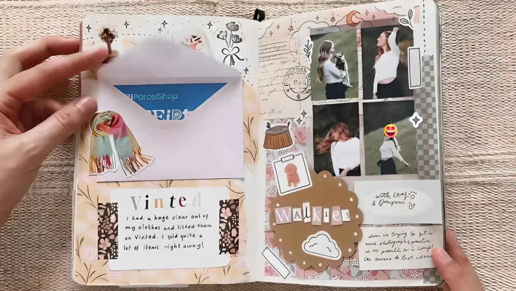
Upper Page: Envelope Pocket
- Soft Floral Base: You used a soft, pastel floral background and vintage-style patterned washi tape to frame the upper section.
- Card Pocket: You created a simple pocket by folding a piece of patterned paper into an envelope shape and securing it to the center. You pulled out a blue bank card or gift card from this pocket, demonstrating its practical use for storing actual cards or gift certificates related to shopping.
- Thematic Label: The word “vinted” is prominently displayed, making the theme of second-hand style clear.
Lower Page: Photo Cluster and Journaling
- Warm Collage: The bottom uses a brown kraft paper background layered with various photos of people outdoors, creating a warm, earthy aesthetic.
- Decorative Tags: A large, decorative tag, labeled “Walkies,” is placed on the left side, adding a focus on outdoor activity.
- Hidden Journaling: A small slip of handwriting is visible, indicating that this area is reserved for personal journaling about the events captured in the photos.
15. The City Exploration Spread (Manchester)
This spread documents a specific trip or city exploration with a focus on vibrant color and bold title design.
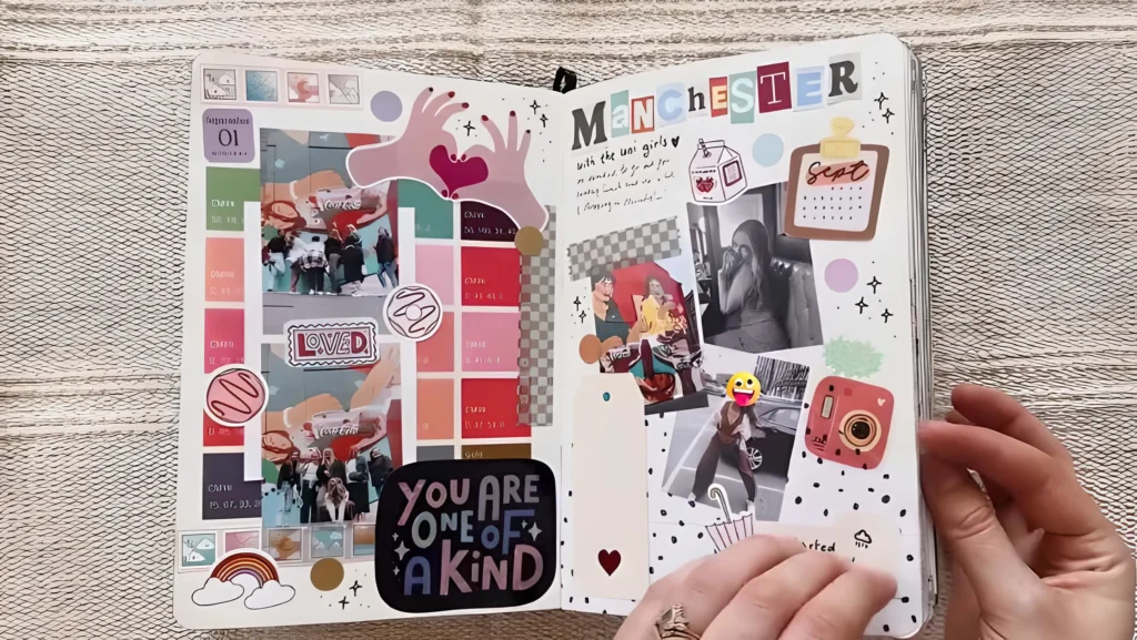
Upper Page: Clean Grid and Color Blocks
- Bright Color Palette: This page uses bright, solid blocks of color (red, orange, pink) against a clean white background, giving it a playful, modern feel.
- Photo Grid: Small photos are arranged in a neat grid, often framed by the colorful blocks or small stickers.
- Thematic Title: The phrase “YOU ARE ONE OF A KIND” is featured on the left, adding an uplifting personal touch to the page.
Lower Page: Location Focus and Detailed Notes
- Bold Title: The city name, “MANCHESTER,” is stamped or cut out using bold, colorful letters, serving as the strong visual anchor for the bottom page.
- Integrated Collage: A collage of photos related to the city (street scenes, food, interiors) is tightly arranged around the central title.
- Handwritten Journaling: A small space is reserved near the photos for detailed handwriting, providing narrative context to the images of the trip.
- Patterned Borders: You used a black-and-white dotted border on the left and a contrasting washi tape strip to frame the photos, completing the spread’s dynamic and organized layout.
How to Make the Cutest Peek A Boo Interactive Card
10 Interactive Junk Journal Ideas to Bring Your Pages to Life
Immortalizing Your Closest Bonds: Creating the Ultimate Aesthetic Friendship Journal
Crafting the Ultimate Personalized Gift: Heartfelt Scrapbook Layout Ideas
15 Inspiring Styles to Kickstart Your Next Junk Journal Spread
10 Inspiring Junk Journal Spreads to Try Today